Events for Talbots: Turning Trunk Shows into Bookable Experiences
Designing an enterprise events platform that turned Talbots' spreadsheet-driven trunk shows into a bookable, brandable, service-aware product.
Context
JRNI had built its name on appointment bookings. The platform was solid there: reliable, scalable, trusted by enterprise clients. But the events module was a different story. It existed, technically. A handful of clients used it. The UX was built on Rails with forms rendered entirely from the backend, which meant limited interactivity and a rigid experience. It worked, but barely, and nobody was excited about it.
Leadership saw a clear opportunity. If JRNI already owned the appointments space, extending into events, and connecting the two, would put the company in a position nobody else in the market occupied. Eventbrite did events well. Calendly did appointments well. Nobody was doing both, and certainly not at enterprise scale with service bookings woven directly into the event experience.
Talbots was the client that made this concrete. They ran thousands of trunk show events every year across hundreds of stores in multiple regions. Their marketing teams coordinated all of it. And at the time, they were managing it on spreadsheets.
The Starting Point
The existing events module had a working skeleton but little operational depth. Forms were rendered from the backend, which meant slow, rigid interactions. There was no public-facing event page, no concept of service bookings inside events, and no way to manage events at scale across hundreds of stores. A handful of clients used it. None loved it.
What I Found During Discovery
I ran interviews with Talbots’ team and other prospective clients to understand how they actually managed events day-to-day. A few things became clear fast.
Spreadsheets were the system of record. It wasn’t just that they used Excel. Every regional marketing team had its own spreadsheet, its own process, its own way of tracking registrations. There was no single source of truth for which events were happening where, who was registered, or whether staff had been assigned.
Upselling services through events wasn’t possible, and that was the real goal. Talbots’ trunk shows aren’t passive. Customers come in, browse the collection, and need one-on-one time with staff in fitting rooms. The old module had no concept of this: customers couldn’t book a service slot, and staff allocation happened manually a day or two before the event. Competitor research confirmed the gap. Eventbrite, Eventfarm, and similar platforms had useful features (invite-only events, tiered ticketing, rich event pages), but none of them connected an event registration to an appointment slot. That was our angle.
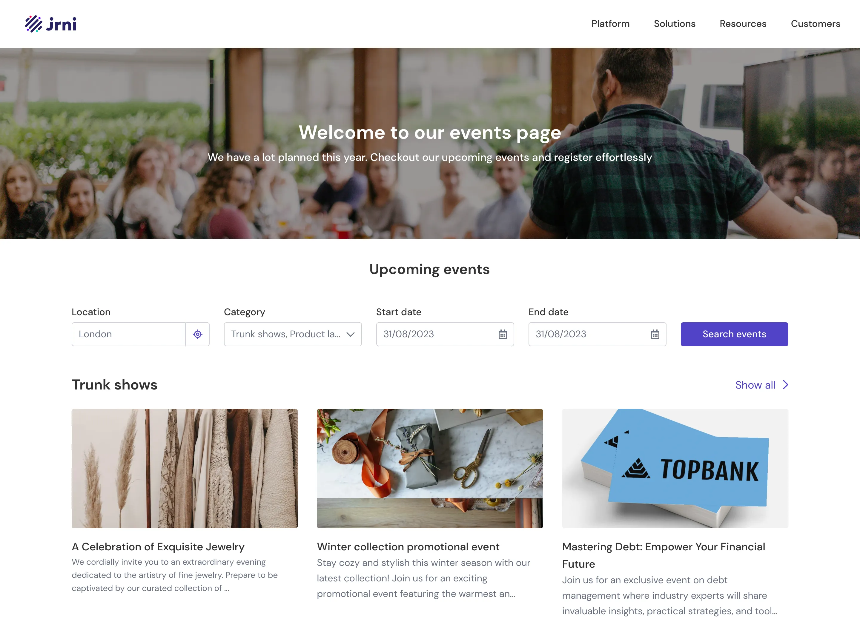
Clients needed a public face for their events. They kept asking for branded landing pages they could drop into email campaigns. The existing module had no public-facing presence at all.
Designing the Platform
The product had two distinct sides, and each needed its own design approach.
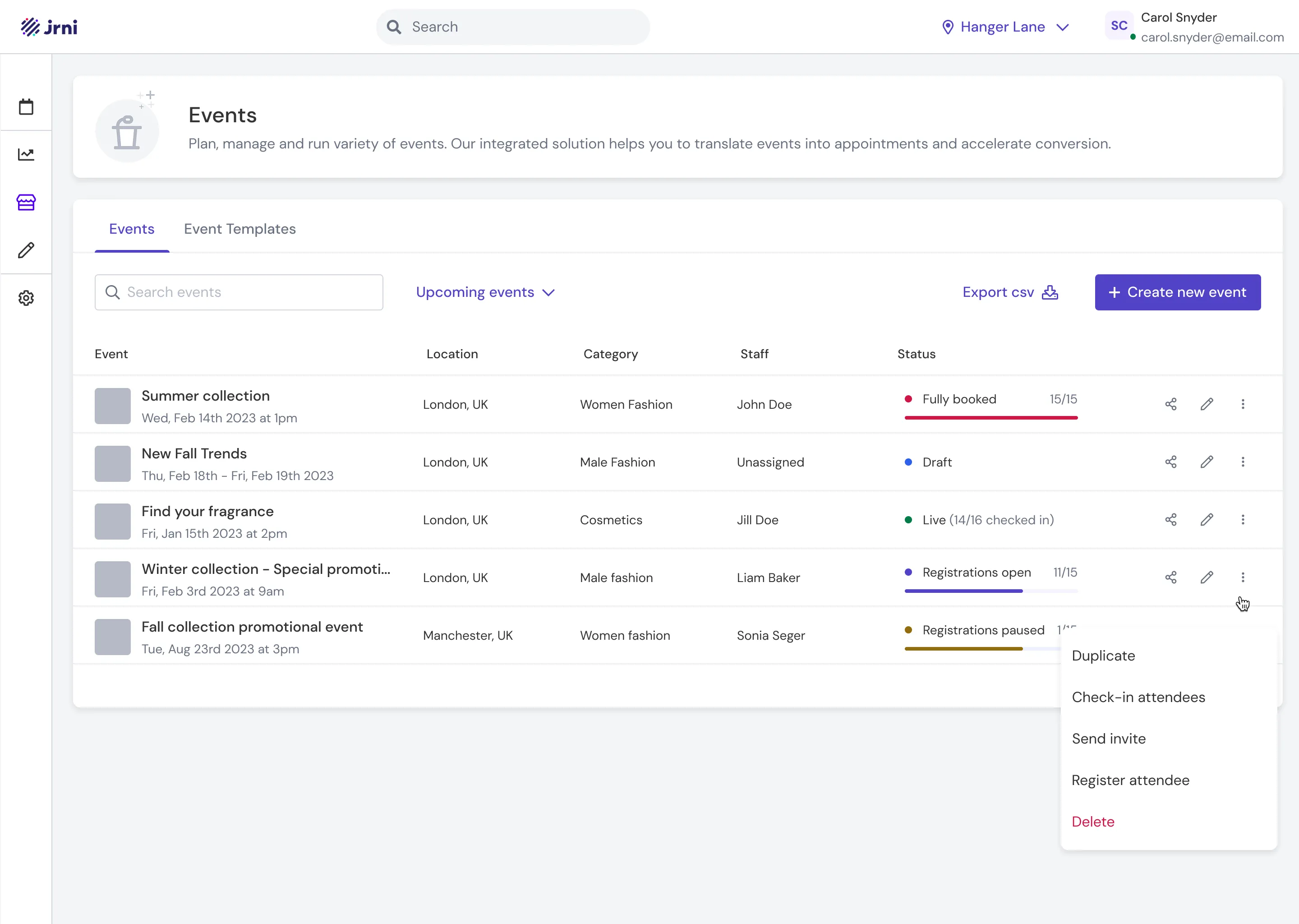
Studio (the admin side) is where marketing teams and store managers create events, build landing pages, link services, and manage attendees. The core challenge here was scale, since Talbots needed to spin up hundreds of events across stores simultaneously.
Event Journey (the customer side) is the public-facing booking flow where customers discover events, register, select service slots, and manage their bookings.
Creating Events at Scale
Talbots ran trunk shows across hundreds of stores, so event creation had to work at scale. One marketing manager in a region might need to push the same trunk show template to 50 stores at once. We solved this with a template-based bulk import system:
- Create an event template at the parent (regional) level
- Optionally build a landing page for it
- Use bulk import to push the template to selected child locations (individual stores)
- Later, use bulk assignment to allocate staff and fitting rooms across those events, typically a day or two before the event
This meant a regional marketing team could set up an entire season’s worth of events in a fraction of the time it took them in Excel.
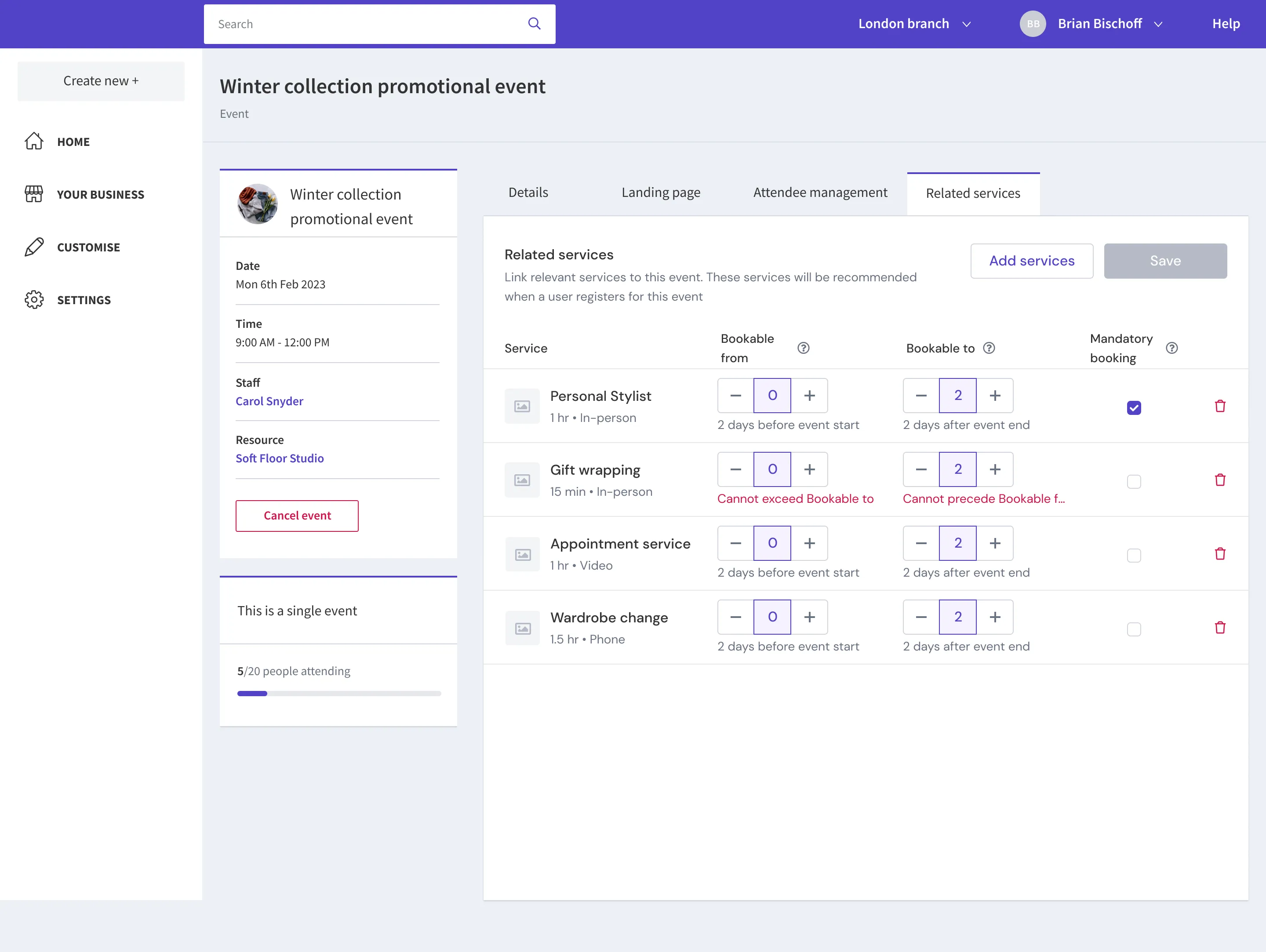
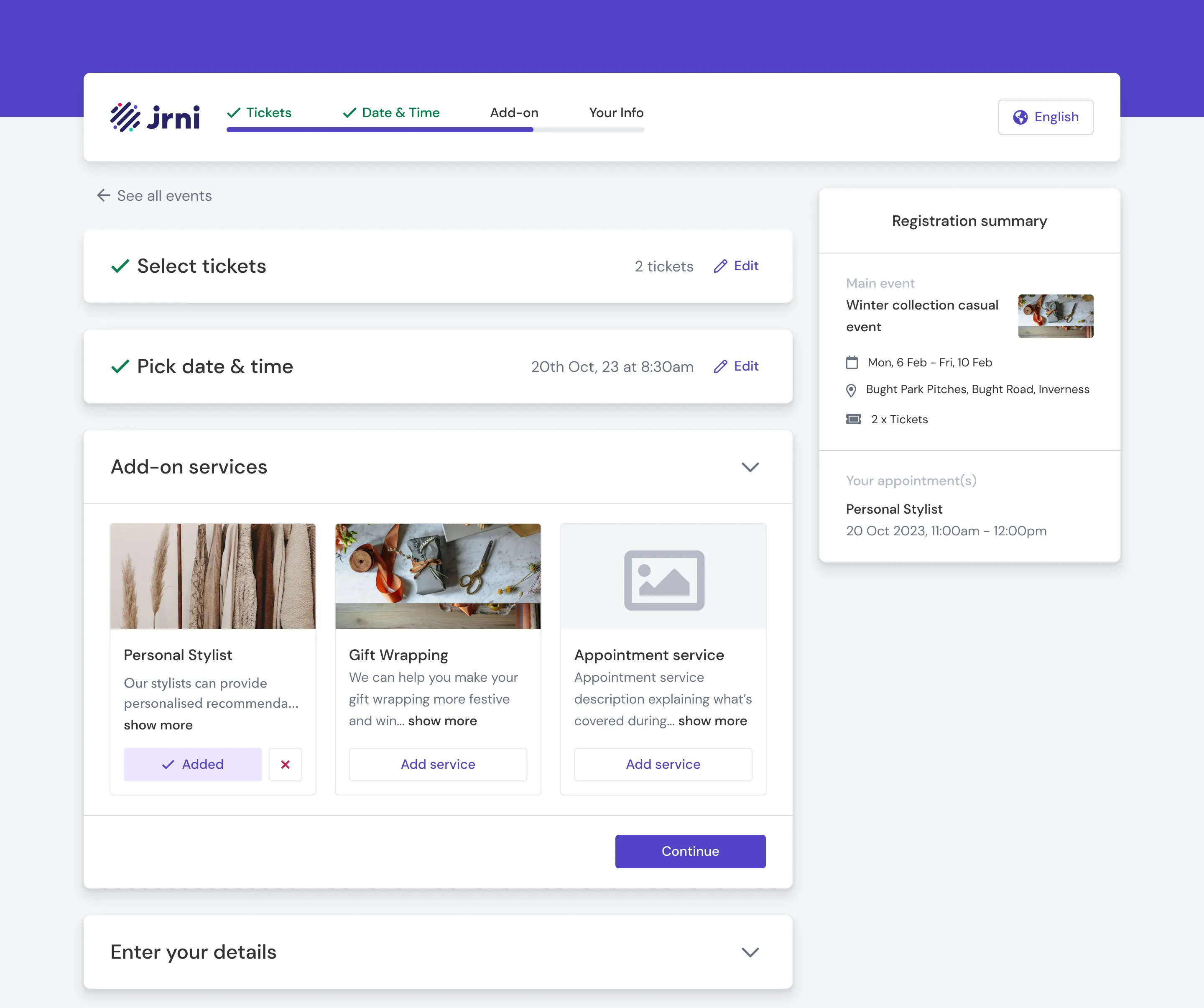
Tying Services to Registration
JRNI already had a strong appointment module, so we built on it. We designed a system where clients could associate services directly with an event, with granular control:
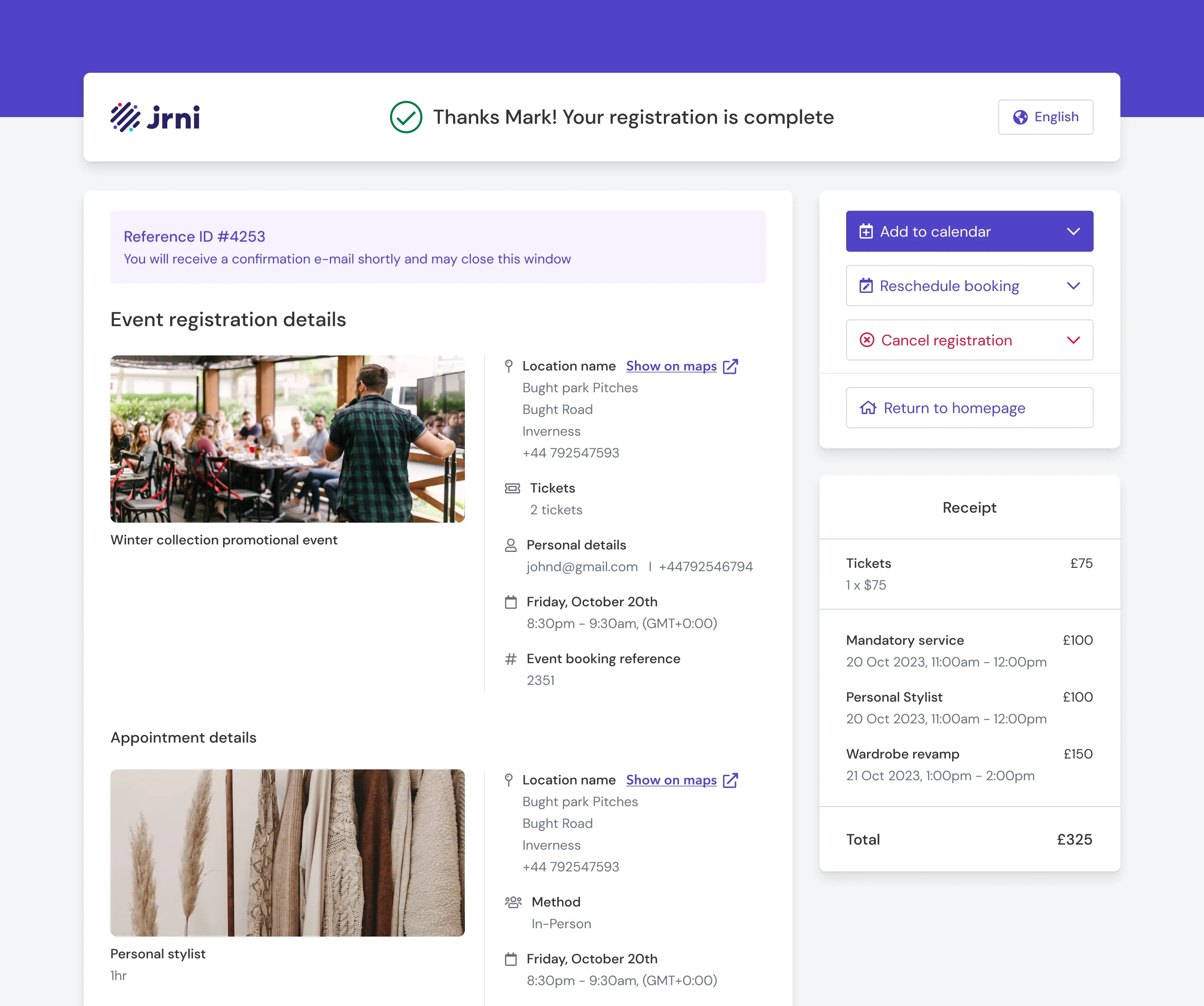
- Mandatory services. A single service (like a fitting room session) that every customer must book as part of registration. This guaranteed staff could plan for one-on-one time with each attendee.
- Optional add-on services (upsell). Additional services customers could choose to add to their booking. These could be scheduled before, during, or after the event, each with its own bookable time range that admins could configure independently. Because these services plugged directly into JRNI’s appointment booking module, they came with built-in staff scheduling, resource allocation, and calendar management.
From the customer’s perspective, this felt natural. You’re registering for a trunk show, you pick your fitting room slot, you optionally upsell yourself on a styling consultation, all in one flow.
The Landing Page Builder
Clients needed to promote events through their marketing campaigns, which meant they needed branded, shareable event pages. But they didn’t need (or want) a full-blown page builder.
I interviewed clients about what they actually needed on these pages. The answer was consistent: a banner image, event description, agenda, related services, and a registration button. No one asked for drag-and-drop layout control or pixel-level customisation.
So I designed a builder with structured, toggleable sections. Each section (Banner Image, Event Description, Agenda, Related Services) can be switched on or off. Content is editable within each section. Clients pick a branding theme and a layout template, and the page assembles itself. The constraint was the feature: it meant any store manager could build a polished event page in minutes without design skills, and every page stayed on-brand. We also built in additional sections like Speakers that Talbots didn’t need for trunk shows, but other clients running panel discussions or educational sessions would find useful.
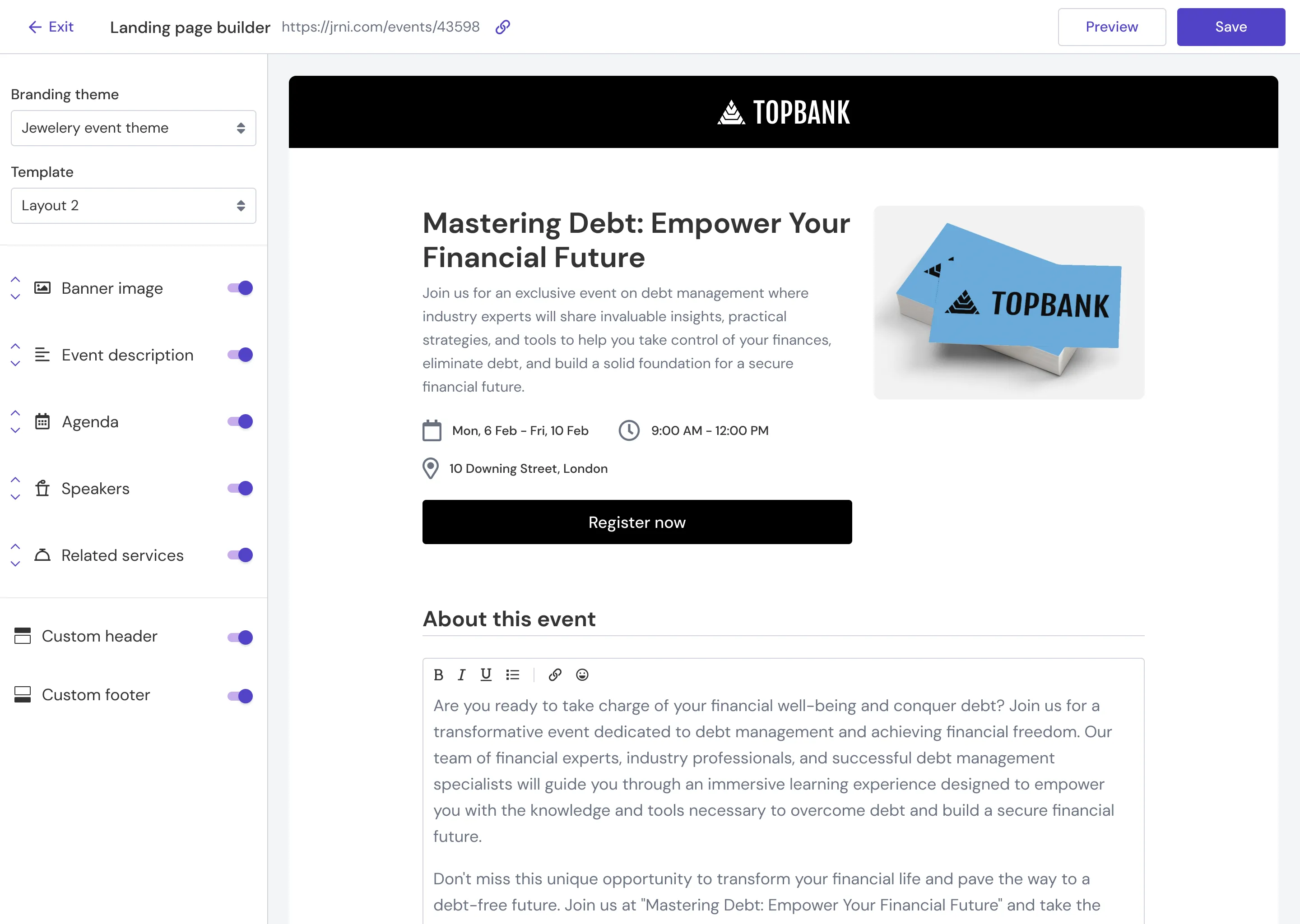
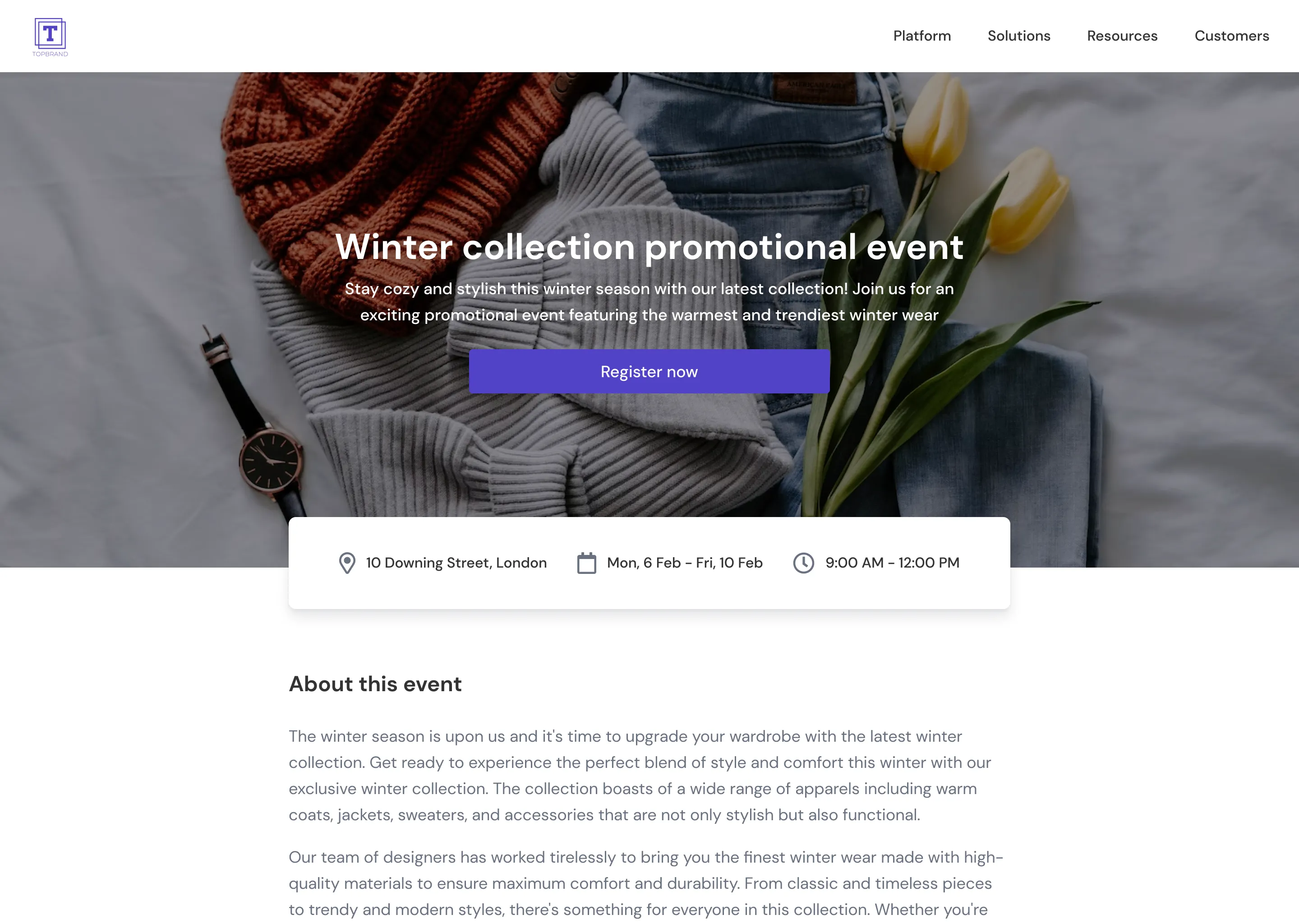
I designed the builder and helped the team build it in React, both the builder interface in Studio and the actual rendered landing pages. The tech stack was part of a broader migration from AngularJS and Rails to React across JRNI’s products.
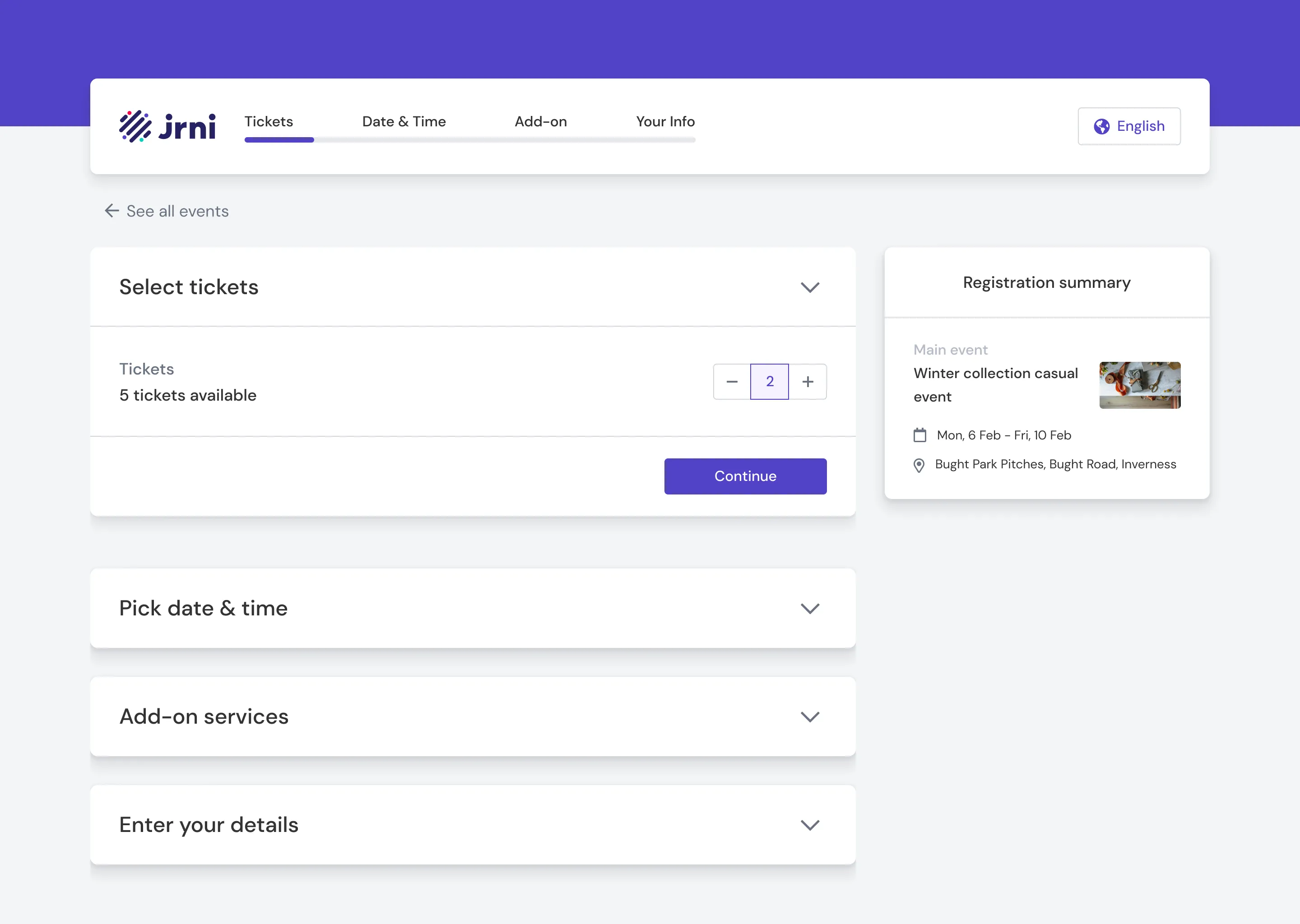
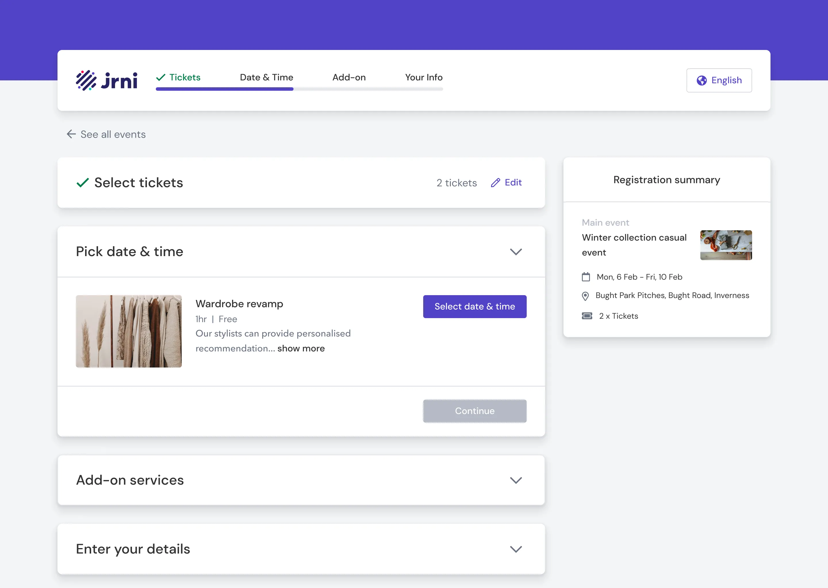
The Single-Page Decision
This was the most contested design choice on the project, and the one I’m most proud of.
JRNI’s existing booking journey used a multi-page wizard, one step per page. For appointment bookings, this made sense because each step depended on the previous one. Your service options changed based on the location you selected, your time slots changed based on the service you picked, and so on.
But the event journey is fundamentally different. It’s closer to a long form than a dependent sequence. You’re selecting tickets, picking a date, choosing add-on services, and entering your details. These steps had no dependencies on each other. Splitting them across separate pages added unnecessary friction: extra page loads, lost context, a feeling of the process being longer than it actually was.
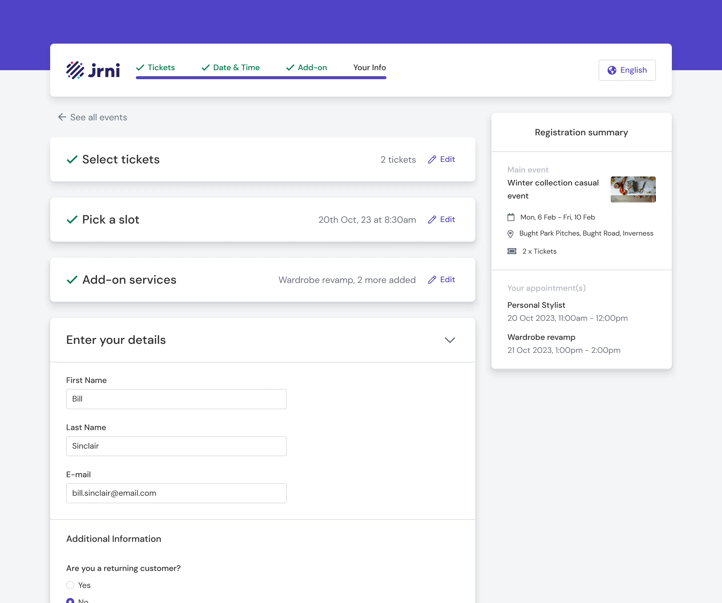
I proposed a single-page flow with accordion sections. All steps visible on one page, expandable as the customer progresses. A sticky registration summary on the side keeps context visible throughout.
The VP pushed back. The new flow would take longer to build than reusing the existing multi-page pattern. It was a reasonable concern, since we had a deadline and a client waiting.
I made the case in a team-wide discussion. The event journey wasn’t an appointment journey, and treating it like one would inherit UX problems that didn’t need to exist. I verified the technical feasibility with the engineering team, and they confirmed it was doable within the timeline with some adjustments. The VP agreed to go with the new flow.
The result was a booking experience that felt lighter and faster, even though it captured the same information. Customers could see the full scope of the registration upfront, which reduced drop-off anxiety.
Rollout and Adoption
We didn’t just ship the feature and walk away. The rollout was structured:
- Internal training. Sessions with the Customer Success Management team, who handle client implementations. They needed to understand the new module deeply enough to configure it for each client’s specific needs.
- Documentation. Help docs covering event creation, bulk import, landing page setup, service association, and the booking journey.
- Feedback loops. Recurring sessions with the CSM team to collect field feedback on what clients were asking for, where they were getting stuck, and what needed refinement.
We’d built the platform with Talbots’ trunk show workflow in mind, but the architecture was flexible enough to support very different event types. Baby Bunting in Australia started adopting it for in-store parenting events. Total Wine began using it for tasting events. ANZ explored it for customer education sessions. Each had different configurations (different service types, different booking flows, different landing page needs) but the same underlying platform supported all of them.
A note worth being upfront about: Talbots was the client that shaped this product, but they haven’t gone live with it. Internal priorities on their side shifted, and the rollout stalled. Baby Bunting, on the other hand, did go live and is actively using the platform for their in-store events. Not every project ships the way you planned it. The work was real, the problems were real, and the platform is in production. It just landed with a different client first.
What I’d Do Differently
Metrics. I wish I’d pushed harder to establish baseline measurements before launch: how long event setup took in Excel, registration completion rates on the old module, customer no-show rates. Without that data, I can describe the improvement qualitatively but can’t quantify it precisely. For any future project of this scale, I’d bake measurement into the project plan from day one.
The email gap. We designed the system to send booking confirmations automatically, and service confirmations went out separately. But event reminders (the “your trunk show is in 3 days” and “thank you for attending” messages) weren’t part of the initial build. Clients had to use their own tools (Mailchimp, their CRM portal) for those. I had a vision for an email template builder similar to the landing page builder, but it didn’t make the cut for V1. It’s a feature that would have made the platform feel more complete.
What I Took Away
This was the largest project I’d owned at the time, from early client interviews through to writing help docs after launch. The technical range was wide: UX research, interaction design, prototyping, React development, stakeholder management, and post-launch support, all within the same year.
The moment that sticks with me is the single-page flow discussion. It taught me that design advocacy isn’t about being right. It’s about doing the homework so you can make a clear, grounded argument when it counts. I’d verified feasibility with engineering before the meeting. I could explain why the existing pattern didn’t fit the new context. And I was specific about the tradeoffs rather than framing it as a no-brainer. That’s the approach I’ve carried into every project since.
The broader lesson was about designing for a market position, not just a feature request. We weren’t building “events” in isolation. We were connecting events to JRNI’s core strength, appointments, and that integration (mandatory service bookings inside events) became the thing that differentiated the product. Talbots validated the idea, but the fact that it generalised to Baby Bunting, Total Wine, and ANZ confirmed we’d built something with a longer shelf life than a single client’s requirements.