HSBC Queue Management: From Dormant Module to Enterprise Backbone
Revamping JRNI's unused queuing product into the system that powered HSBC Singapore's flagship branch, and unlocked a new market for the company.
Context
JRNI had built a strong reputation in the appointment booking space. Clients like HSBC, Santander, and Chanel used the platform to manage scheduled appointments across their branches. But sitting inside the platform was another module, queuing, that had never gained traction. It was functionally thin, lacked the operational depth that branches needed, and no customer had adopted it.
Leadership saw an opportunity. After conversations with HSBC and an assessment of the competitive landscape in queue management, the decision was made to revamp the module entirely. The reasoning was strategic: most queue management systems handled queues in isolation, and most appointment systems handled bookings in isolation. If JRNI could combine both in a single platform, appointments and walk-in queues managed side by side, it would occupy a unique position in the market.
The stakes were tangible. HSBC Singapore was a new prospect, and closing them depended on the queuing revamp shipping successfully. HSBC UK, an existing appointment customer, was also lined up to adopt the new module. The revamp was a revenue expansion play with named customers waiting on delivery.
The Starting Point
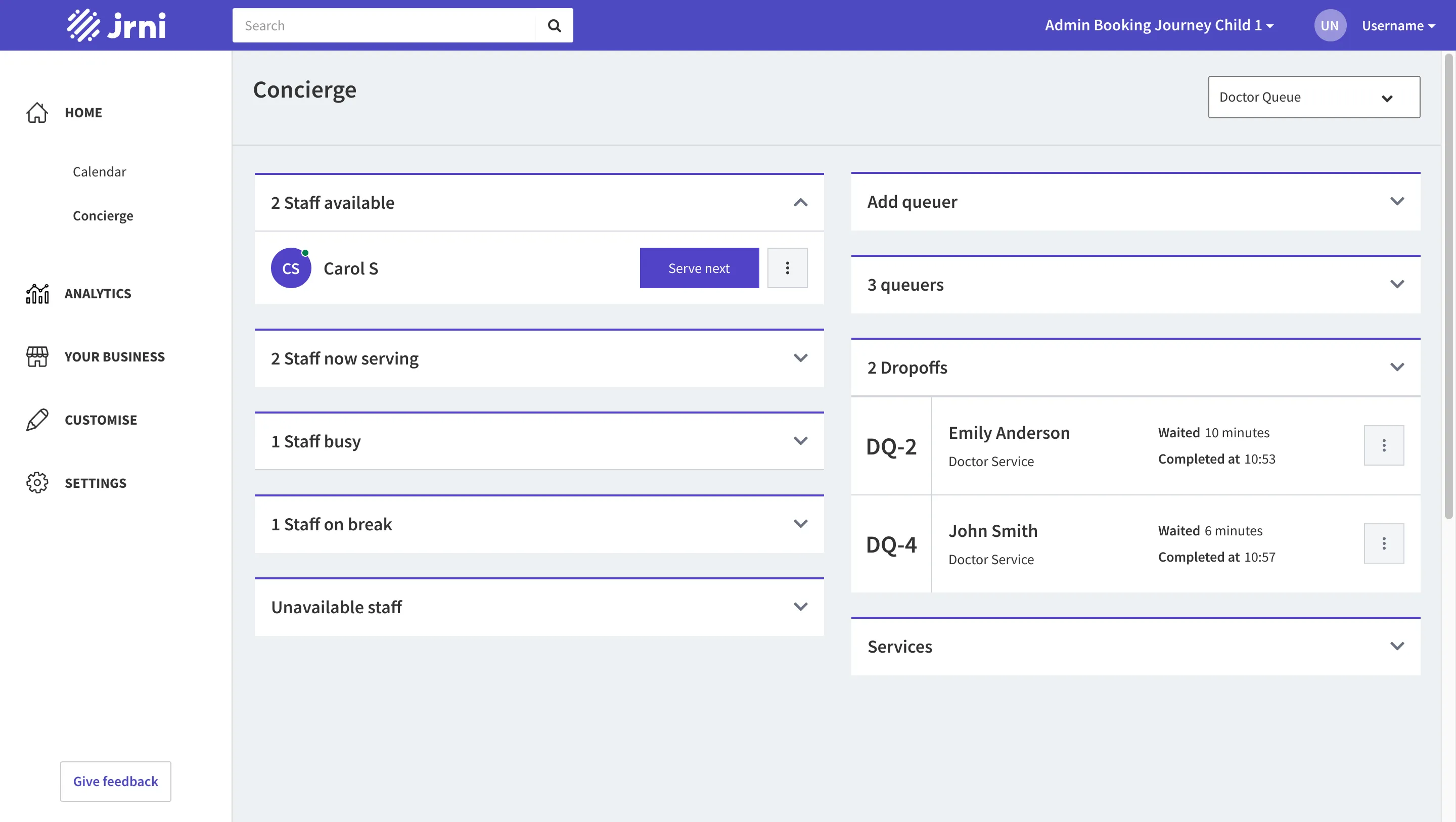
The existing queuing module had the basic skeleton in place: a concierge view with staff grouped into sections (available, now serving, busy, on break, unavailable), a queue panel on the right showing customers waiting, and a display board that cycled through one queue at a time. But it was surface-level. Branch staff couldn’t transfer customers between queues. Managers had no real-time visibility into operations. There was no way to communicate with waiting customers, and no awareness of upcoming scheduled appointments alongside the live queue.
In short, the module had the right shape but none of the operational muscle that an enterprise branch environment demands.
Research, and an Honest Constraint
Our research consisted of remote stakeholder sessions with HSBC Singapore (a team of 4) and conversations with HSBC UK. We established a weekly feedback cadence: designs were shared, reviewed, and iterated on every week throughout the project.
I want to name a constraint honestly: I never visited a branch. The entire research phase was stakeholder conversations, not direct observation. This mattered, and it showed. More on that in the next section.
What we did learn from the sessions reshaped the product direction. HSBC’s branch operations were more nuanced than we’d assumed. Their services weren’t a flat list. They were organized into tiers: Personal Banking, Premier, Premier Elite, Private Banking, and Business Banking. This hierarchy drove real operational decisions. Premier and Premier Elite customers needed to be served with priority, which meant staff allocation had to respond to queue composition in real time.
We also discovered a role we hadn’t designed for: the greeting staff. We learned about the need for customers to be transferred between queues and staff. We uncovered the requirement for a branch display board, in-queue messaging, break notes, missed appointment recovery, and more. In total, we identified 11 major feature requirements that the current module couldn’t serve.
But the most consequential discovery was about the dashboard, and it started with us getting it wrong.
The Dashboard Pivot
This is the part of the project I learned the most from.
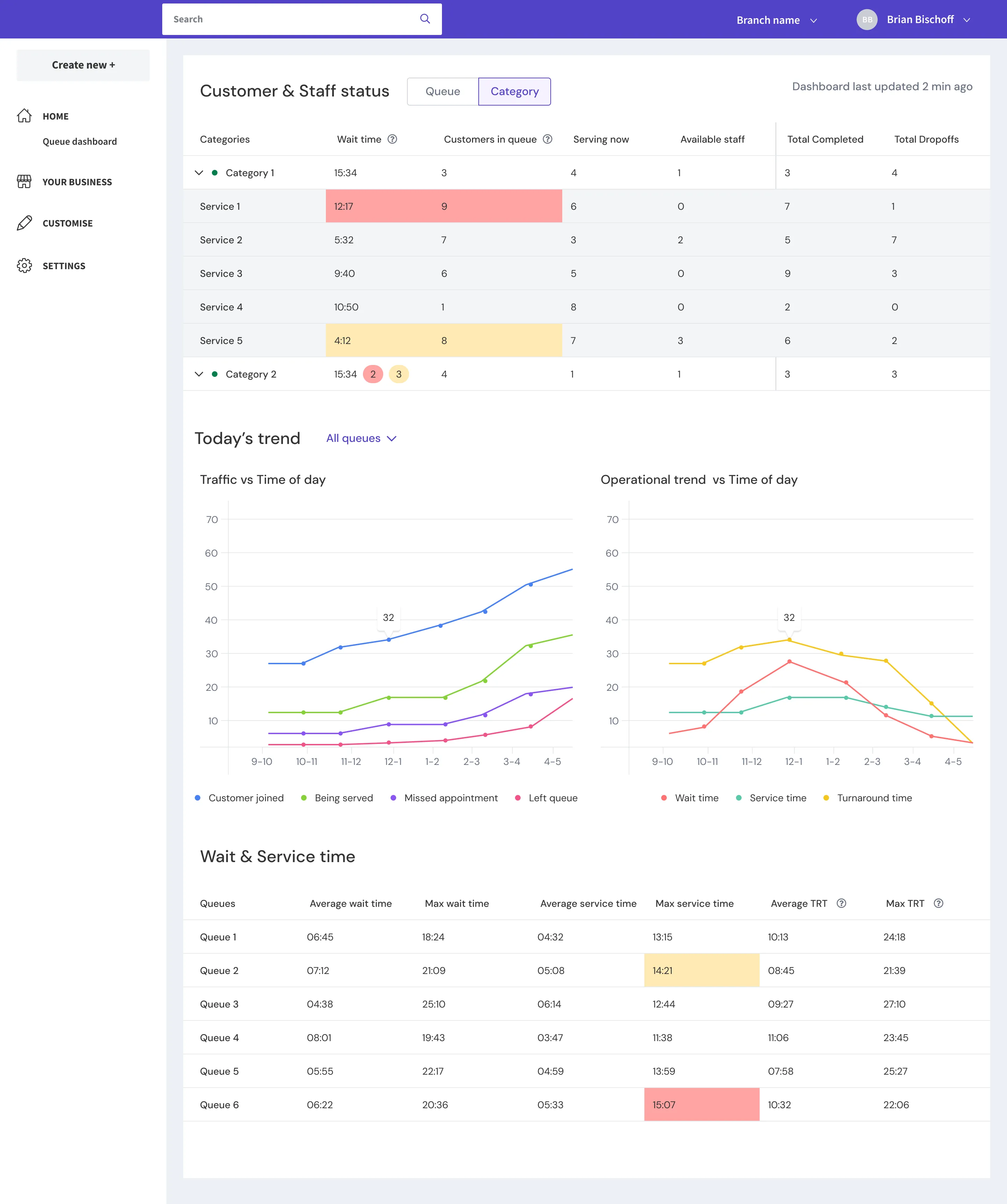
When we designed the real-time dashboard, we had no existing version to iterate on. It was a blank canvas. So we designed based on intuition, based on what we thought a branch manager would need to see. The result was a monitoring-oriented layout: queue metrics displayed generically, ungrouped, meant for passive observation.
We brought it to HSBC in our weekly session. Their feedback was immediate and unambiguous: this wasn’t what they needed.
Three things we’d gotten wrong:
1. Information needed to be grouped by service category, not by queue.
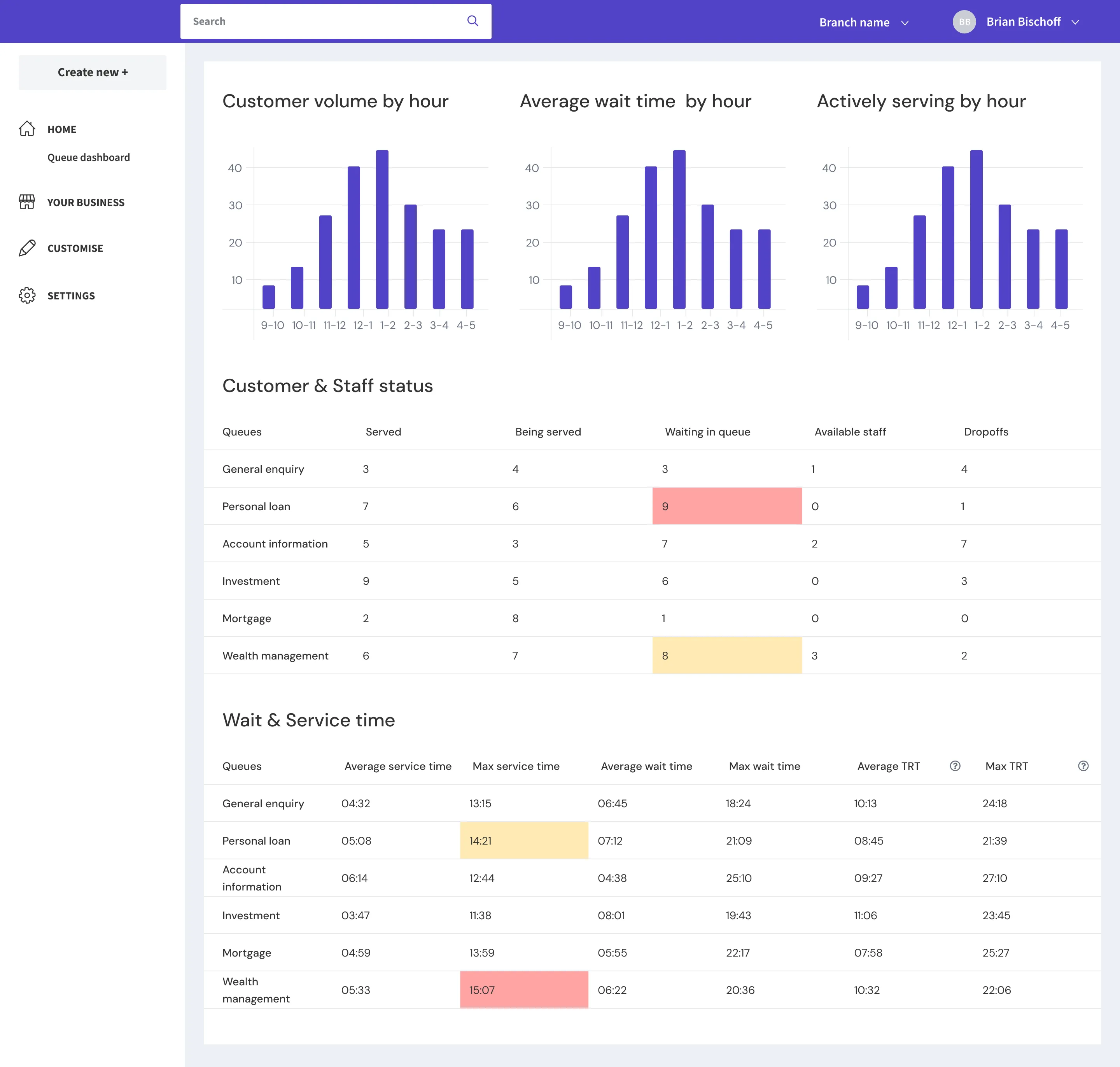
HSBC didn’t think in queues. They thought in service tiers. A manager needed to see at a glance whether Premier Elite wait times were climbing, not whether “Queue 3” had a backlog. The category-level grouping drove every operational decision on the floor.
2. The dashboard had to surface actionable thresholds, not just numbers.
Raw metrics weren’t enough. Managers needed configurable amber and critical thresholds, per queue and per metric, so they could see at a glance when something required intervention. A wait time of 12 minutes might be fine for general enquiries but critical for Premier.
3. Managers wanted to take action from the dashboard itself.
The dashboard also needed to serve as an action center. HSBC wanted the ability to reassign staff to queues directly from the dashboard when they spotted an imbalance. Observing a problem and acting on it needed to happen in the same place. We didn’t get to implement this within the project timeline, but the first two insights fundamentally reshaped the design.
The redesigned dashboard reflected the first two insights. The top section grouped active metrics (wait time, customers in queue, currently serving, available staff, completions, and dropoffs) by service category, with threshold-based color coding (green, amber, red). Below that, trend charts showed the day’s trajectory across customer joins, service activity, missed appointments, and departures. A final section displayed average and maximum wait time, service time, and turnaround time (wait + service) broken down by queue. Worth noting: this is an operational dashboard, scoped to the current day only. JRNI’s separate reports feature handles historical data and longer-term analysis.
The lesson: Our weekly cadence with HSBC caught this misalignment before we shipped. If we’d had a longer feedback loop, or if I’d observed branch operations in person, the first design likely would have been closer. But the weekly rhythm compensated for the gap in direct observation, and it shaped how we approached every subsequent feature: assume nothing, validate weekly.
Designing for Greeting Staff
HSBC introduced us to a role that the existing system hadn’t accounted for: the greeting staff. These are the concierge-level employees stationed at the branch entrance. They greet customers, understand their needs, add them to the appropriate queue, and guide them to the right area. They’re assigned to a queue, but they don’t actively serve customers from it. Unless the branch gets busy.
That “unless” was the key design decision.
We modeled greeting staff as a status, not a tag or a separate role. Why? Because a tag would have made them a distinct user class, visible but rigid. A status meant they remained part of the existing staff pool with full flexibility. During peak times, a greeting staff member could flip to “available” and start serving customers immediately, then return to greeting when volume dropped.
On the concierge, the greeting staff section sits between “now serving” and “busy,” visible to the manager, showing their next scheduled appointment and a button to make them available when needed.
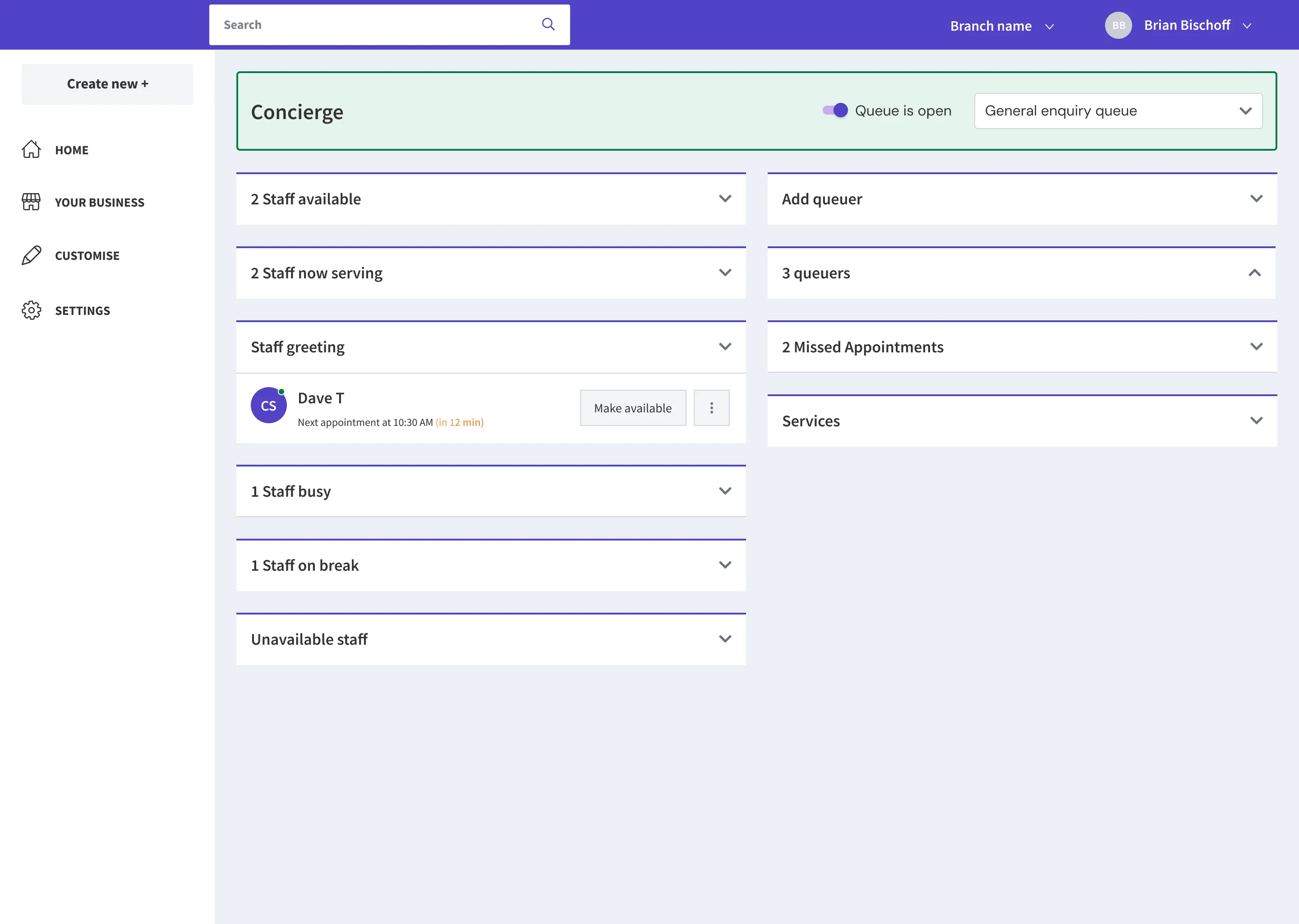
This was a small modeling decision with outsized operational impact. It kept the system flexible without adding complexity to the data model.
Key Design Decisions
Of the 11 features we shipped, a few involved decisions worth unpacking.
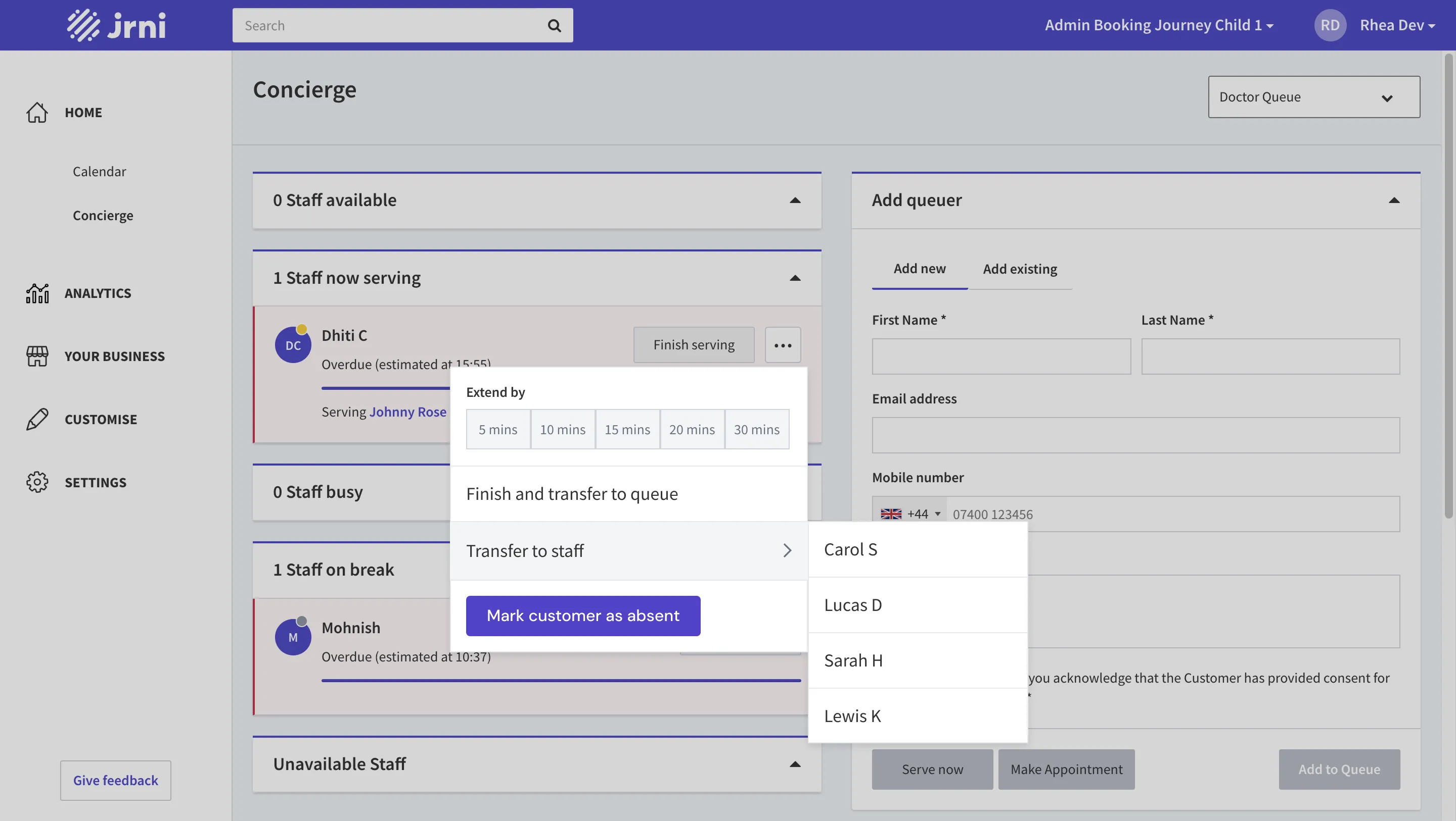
Transferring Customers Between Queues and Staff
On the surface, transferring a customer from one queue to another sounds straightforward. In practice, it created a reporting problem: HSBC needed to maintain a complete audit trail of each customer’s journey through the branch. If a customer moved from the general enquiry queue to personal loans, the system needed to track that path.
We made three decisions to solve this. First, the ticket number stays the same across transfers. This preserves the identity of the customer’s visit regardless of how many times they move. Second, when a staff member initiates a transfer, a second screen appears where they manually select the new service for the destination queue, so reporting accurately reflects what the customer was ultimately served for. Third, if transferring to a specific staff member, that staff member must already be assigned to the customer’s current queue. This prevents orphaned transfers and keeps the data clean. Notes attached to the customer follow them through every transfer.
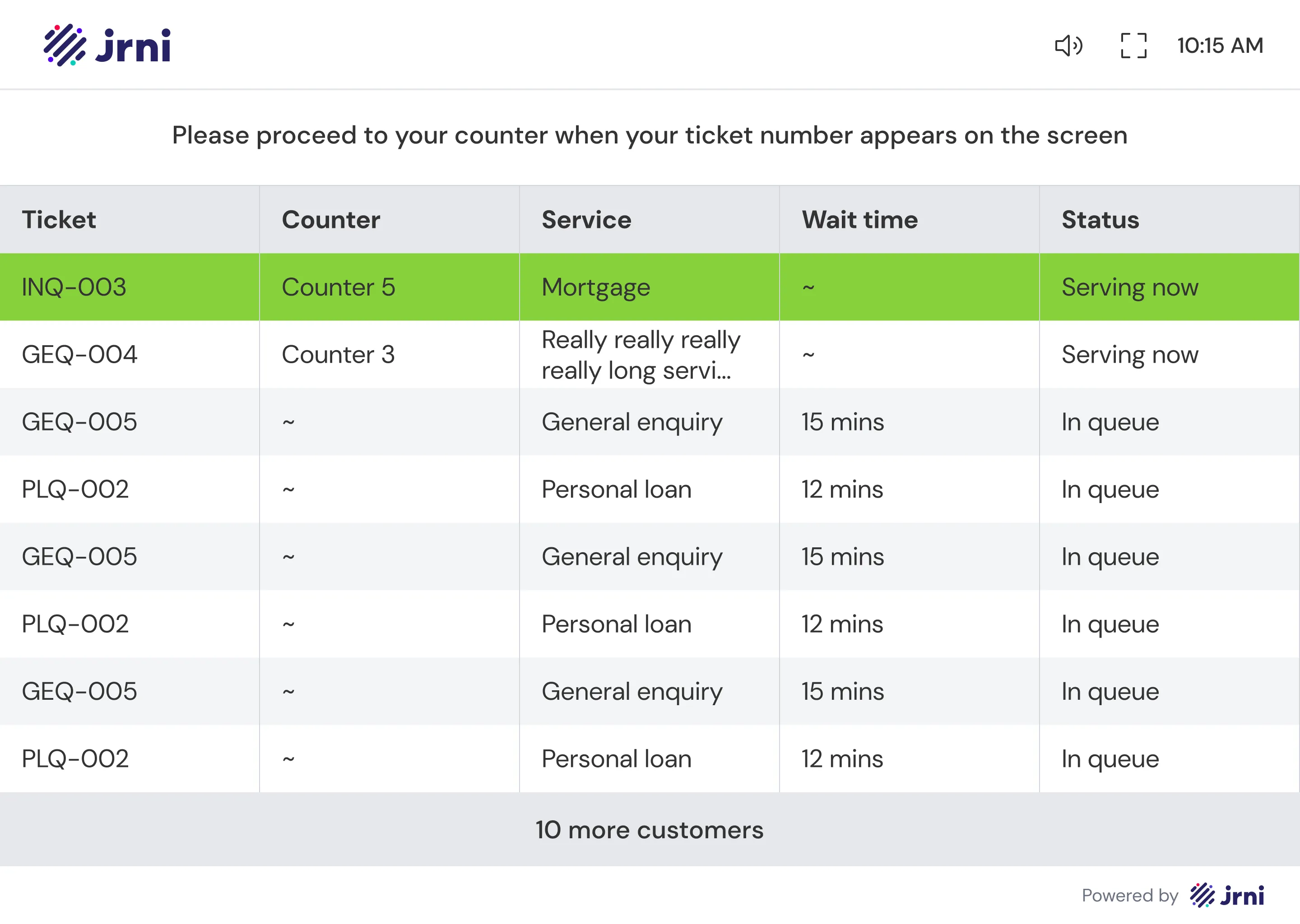
The Display Board
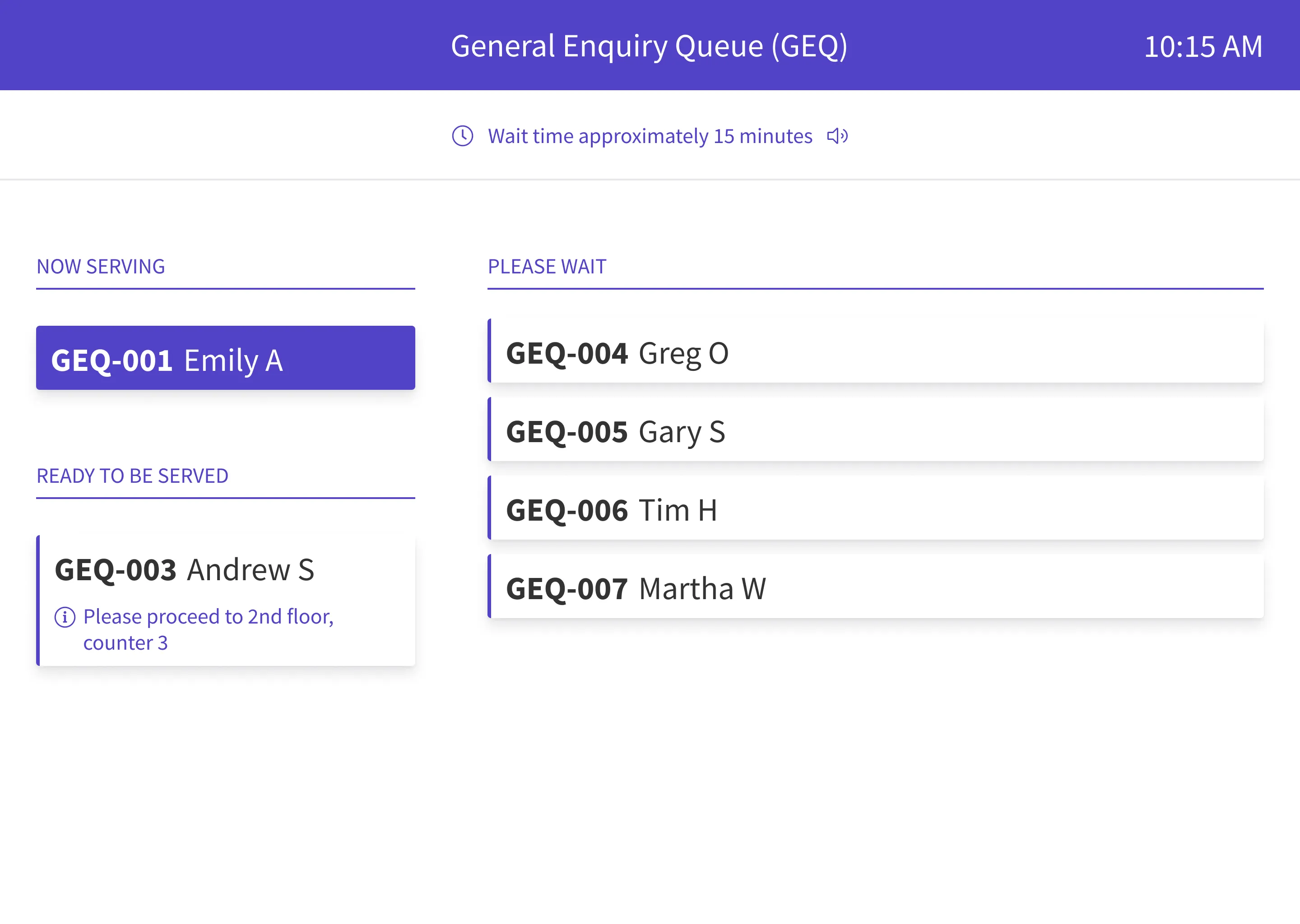
The display board is the customer-facing screen mounted in the branch, the one that tells waiting customers when it’s their turn and where to go. The old module already had a display board, but it showed one queue at a time, rotating through them at regular intervals.
We redesigned it into a unified table view that combines all selected queues into one screen. The reasoning came down to two things: customers don’t need to know which queue they’re in, they only need to know their ticket number and whether their turn is up. And with the old rotating design, a customer would have to wait for their specific queue to cycle onto the screen before they could check their status.
Beyond the structural change, two design choices I’m particularly satisfied with:
Attention without annoyance. When a customer’s turn arrives, their row blinks in a bright color for 10 seconds, then holds solid for another 30 seconds before returning to the default state. This two-phase approach draws attention without creating constant visual noise for everyone else in the branch. A chime accompanies the blink, with a toggle in the top bar to mute it.
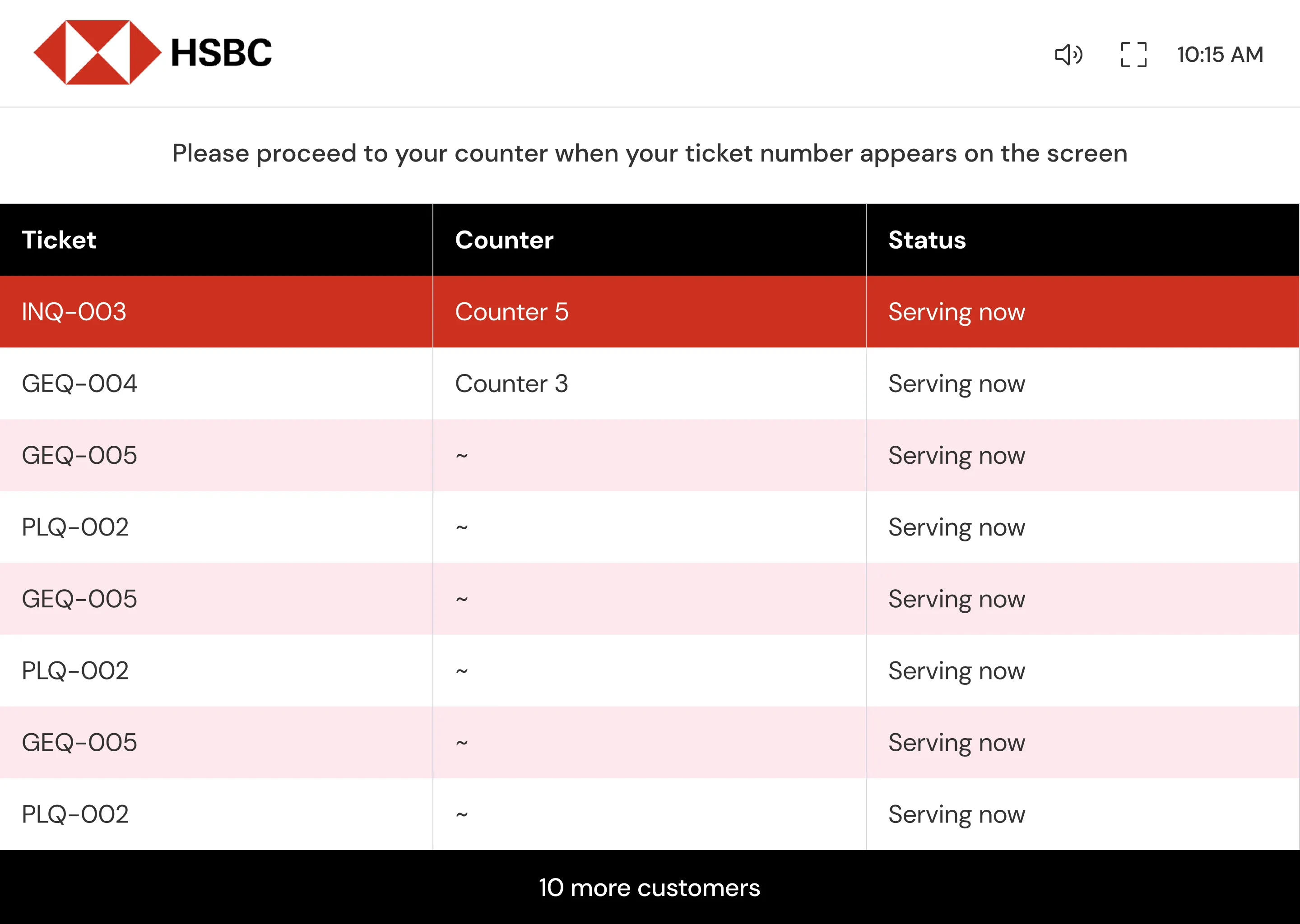
Overflow handling. When the number of active tickets exceeds the screen’s capacity, managers can choose between two modes: a two-table layout that splits the view, or a simplified mode where overflow rows are hidden with a “X more customers in queue” indicator. Display boards are configured in Studio (JRNI’s admin app), where managers choose which queues appear on each board and which columns are visible. Multiple queues can feed into a single display board.
HSBC’s configuration. The configurability paid off immediately. HSBC’s Claymore branch added their own logo, hid wait time (they didn’t want to display an estimate that could be inaccurate), hid customer name (anonymity on a public screen), and hid the service column. They also chose to only show customers currently being served, not those still waiting in queue. The same component, configured to fit a specific branch’s policies.
In-Queue Messaging
Staff can message customers directly from the concierge, either from the queuer card on the right panel or from the staff card on the left. Messages appear as a chat thread, allowing staff to send preparation instructions (“Please carry the required documents with you”), location details (“Proceed to 2nd floor, room no. 3”), or respond to customer replies.
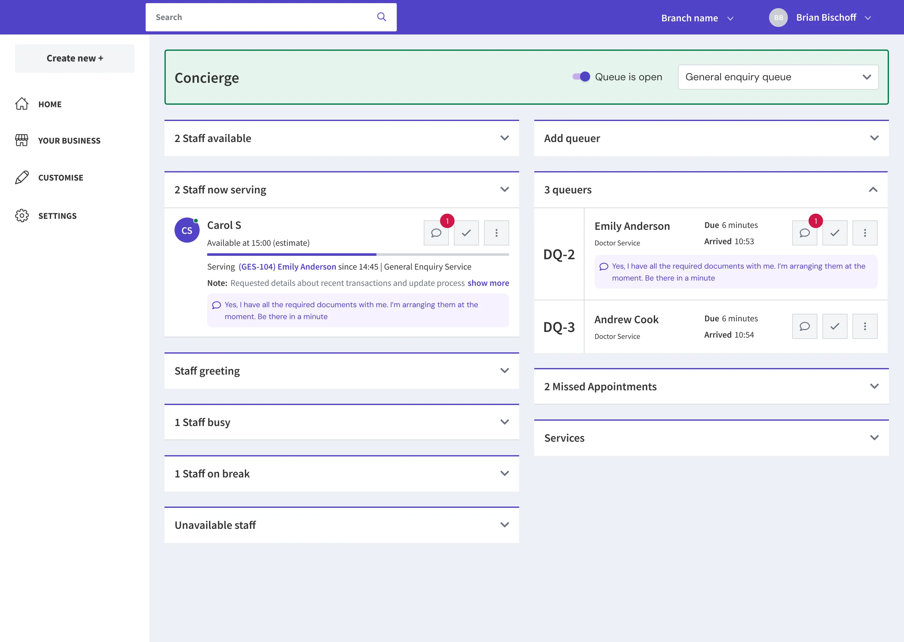
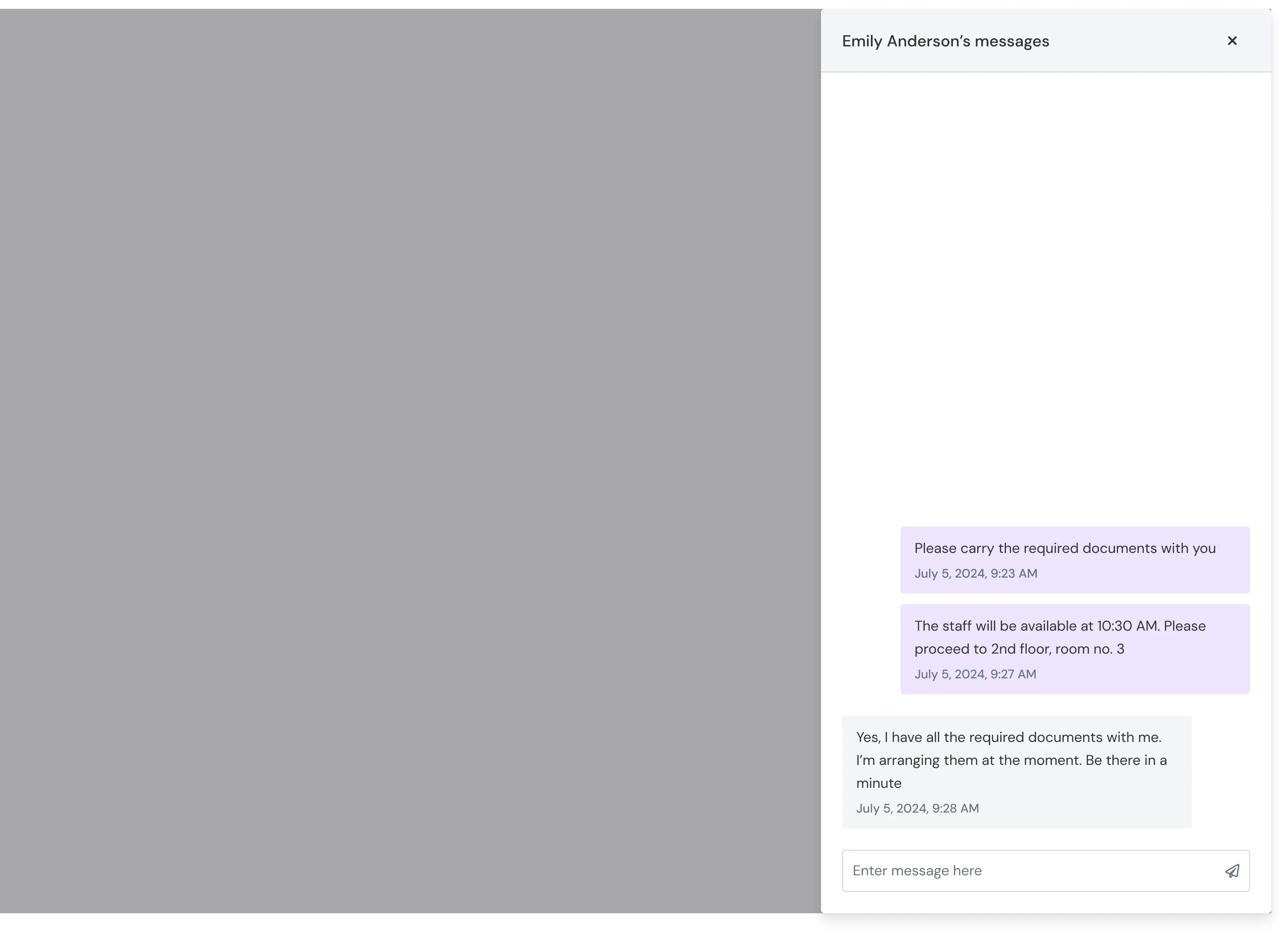
The messaging notification badge appears on the queuer’s card, so greeting staff can see at a glance which customers have responded.
Everything Else We Shipped
Beyond the features above, we also delivered:
- Prescheduled appointment indicator. Each staff card shows upcoming appointments, so the team can factor them in when assigning a queuer. If a staff member is already serving a prescheduled appointment, a red calendar icon appears next to their name, with a hover tooltip showing when they’ll be free.
- Queue scheduling. Auto-open and auto-close by day of the week, plus a manual emergency toggle on the concierge.
- Desktop notifications for staff when customers join a queue.
- Missed appointment recovery. A new section which shows customers who missed their appointment or left the queue, with the ability to serve them immediately or re-queue them.
- Busy and break status notes.
- Staff location indicators (counter 1, counter 2, etc.).
- Search within the missed-appointments section on the concierge, so staff can quickly recover a queuer when they show up at the desk.
Outcome
The revamped queuing module went live at HSBC Singapore’s Claymore branch, handling 100+ daily customer interactions through the system. The deployment covered the full scope: concierge with all 11 features, real-time dashboard, display board, and in-queue messaging.
The results spoke through action more than metrics. HSBC was sufficiently satisfied with Claymore’s performance that they initiated expansion planning to two additional Singapore branches. HSBC UK’s implementation was also underway.
For JRNI, the impact was strategic. The queuing revamp validated the company’s entry into a new market segment, queue management, with a flagship reference customer. The combined appointments-plus-queuing positioning that leadership had envisioned was now a live, proven product.
What I’d Do Differently
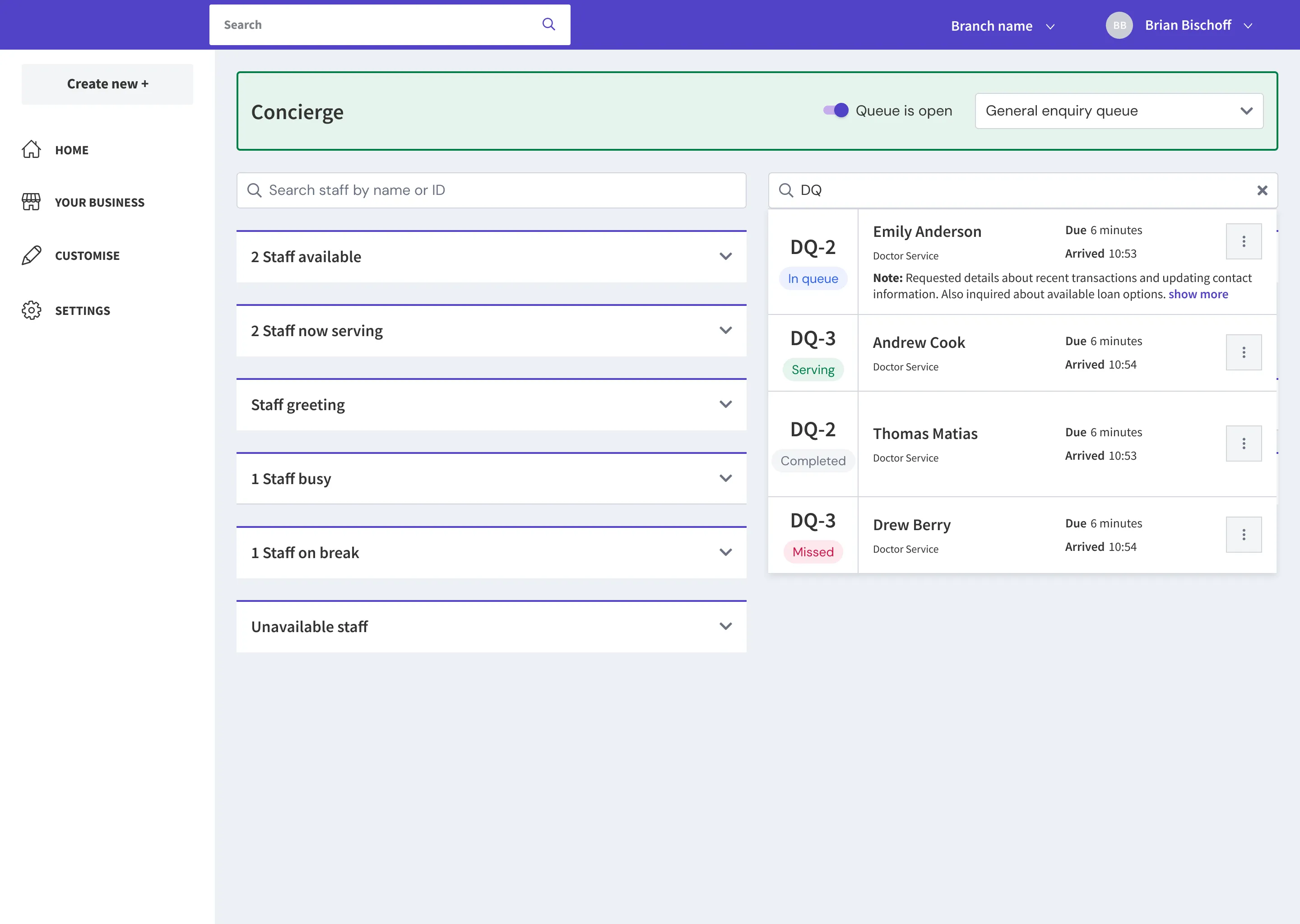
Global search on the concierge. We implemented search for the missed queuers section, because that list would grow long throughout the day and staff had trouble locating a customer when they showed up at the reception desk. In hindsight, a global search across the entire concierge would have been more valuable. A staff member could simply search for any customer and immediately see which queue they’re in, their status, notes, and other relevant information, without needing to scroll through individual sections. I’d prioritize this in v2.
One in-person branch visit. The dashboard pivot story illustrates this clearly. If I’d spent a single morning watching a manager allocate staff in real time, I would have understood the category-based, action-oriented mental model from day one instead of learning it through feedback on a wrong design. Remote stakeholder sessions are valuable, but they’re not a substitute for direct observation, especially for operational software.
What Came Next
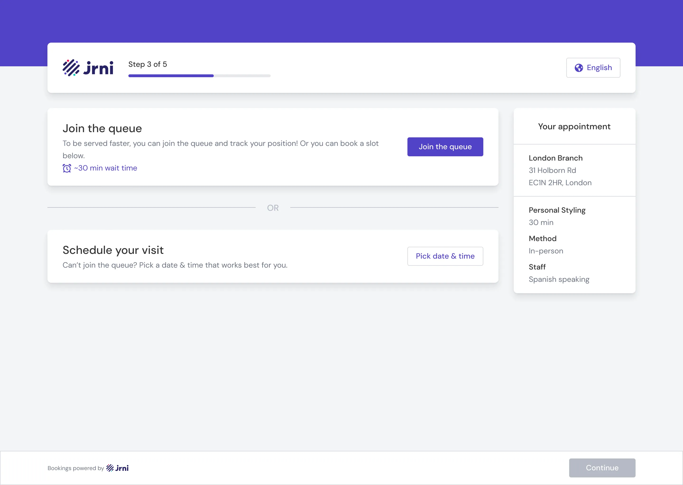
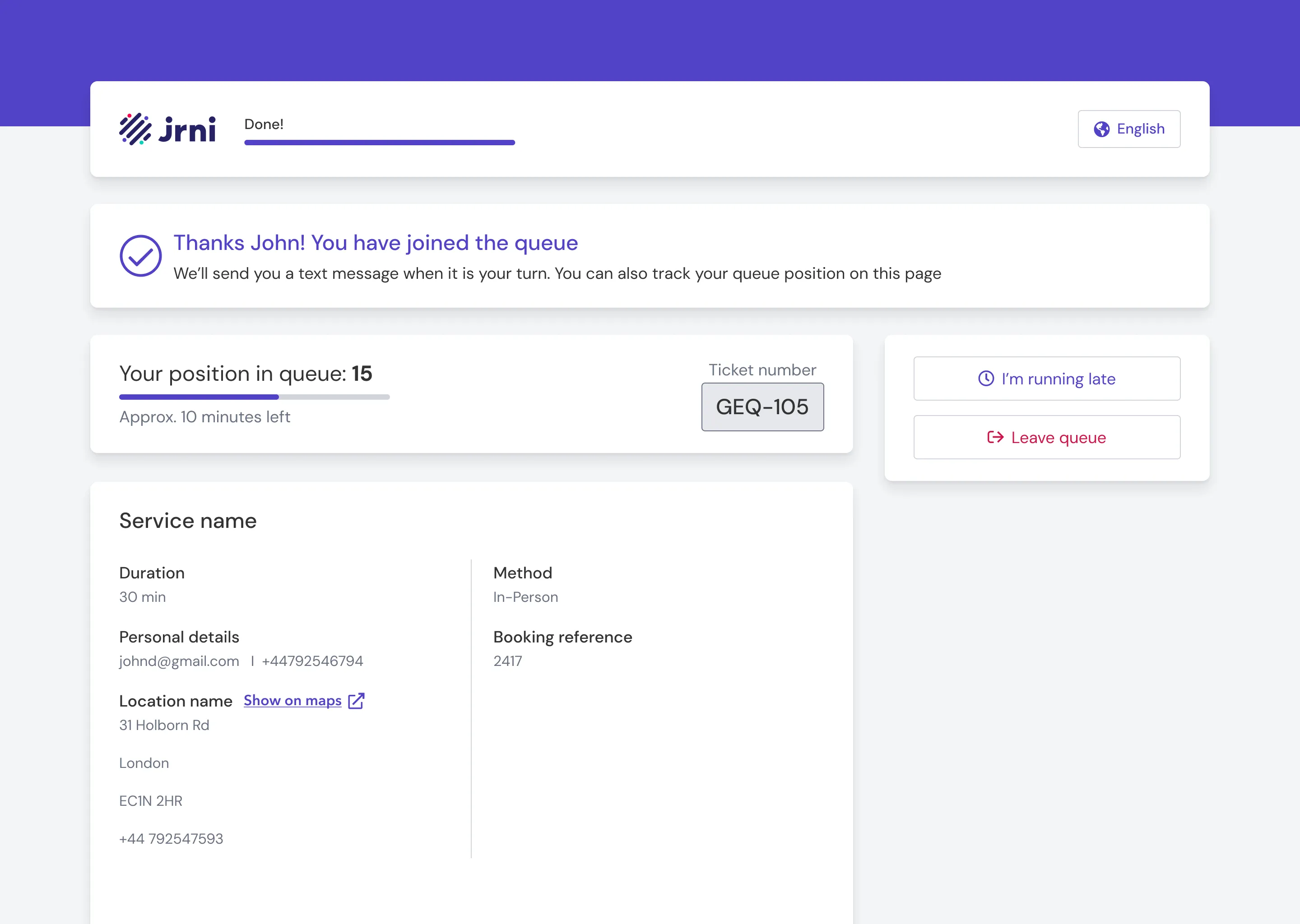
While the queuing module was the primary focus, I also extended JRNI’s existing customer appointment booking journey to support queue functionality. JRNI’s new and improved booking flow now lets customers choose, at the very start, whether to book a scheduled appointment or join a live queue, all within the same interface. This is the unique value JRNI offers: appointments and queues, side by side, in one product. Most competitors handle one or the other; here a customer can pick whichever suits them in the moment, and the branch sees both streams in one place. I designed and shipped these additions, which were built and deployed for several JRNI customers, though we didn’t get the chance to migrate HSBC over to it.